
Hey there, my friends! Today's floral springtime card is quite simple with a stamped image and sentiment but I'm going to show you some tips to make your stamped images SHINE and take center stage. Simple doesn't have to mean BORING - and today I'll prove it!
This blog post contains affiliate links. When you shop through my links I receive compensation at no cost to you. Thank you from the bottom of my crafty heart!

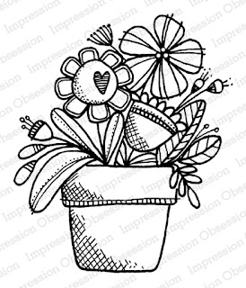
Today's card features this sweet potted flower arrangement called Big Flower Pot, from Impression Obsession. It's such a sweet image and I wanted it to remain the focus of my card. One stamp plus one simple sentiment could equal BORING - but not today. Let's look at a few ways to showcase one stamp and make a big statement on a card.
Begin With the Background
For added POP, begin a simple card with a simple embossed background. Adding an embossed panel to a card can provide the perfect amount of subtle background to make a card more interesting without being distracting. (And I'm always.always a sucker for polka dots.)
Think About Die Cuts in a New Way
Another way to give extra POWER to a single stamped image is with an unexpected die cut layer. For today's card I used the Three Rectangle Frames dies. The aqua rectangles help tie the colors together, and the shapes anchor the floral image and give it a virtual resting place on the card. This same idea can be achieved with any die cut shape or shapes; sometimes even just a scrap strip of cardstock is all you need to ground your image and give it some weight.
My Favorite Rule - of THREES

- We're giving away THREE Impression Obsession Grab Bags - the more you comment, the more chances to win!
- Comments will be open until March 22nd at midnight CT. All winners will be announced on March 23rd on the Impression Obsession Blog.
- Find all the new release stamps HERE


ReplyDeleteWhat a pretty card!! Love the bright happy colors and how you used the Rule of 3.
This card screams SPRING...SPRING...SPRING! (three times...lol)
<3 J
jwoolbright at gmail dot com
HerPeacefulGarden.blogspot.com
Bright, fun colors! Love all the spring release!
ReplyDeleteTexture & color....what's not to love! The new goodies collection is over the top cute!
ReplyDeleteWhat a great design! I LOVE the flowers and bright colors!
ReplyDeletelove the soft colors you have used on this lovely card
ReplyDeleteThis card shouts Spring! I love it. Such a cheery card.
ReplyDeleteI love the happy colors. I tend to be monochromatic so when I see a dazzler like this it really grabs my eye.
ReplyDeleteGreat layer and texture use.
ReplyDeleteAwesome layering and color combo! Love the potted flowers!
ReplyDeleteSuch a cute layout with those panels, and the embossing just adds to it too! Great card!
ReplyDeleteCute, cute card. I like the colors.
ReplyDeleteCute design and great choice of colors.
ReplyDeleteThanks for the rule of three reminder. That cute stamp has 3 big flowers in the pot! And I like the 3 rectangles and embellishments.
ReplyDeleteI love your unique layout, using the rectangles horizontally, instead of vertical. Such a pretty card - spring is finally here! :)
ReplyDeleteLove your beautifully layered card! It is so bright and springy!
ReplyDelete